Alight UX Research & Design
Project Overview
In the summer of 2021, I worked alongside the Alight design team as a UX Research Intern. While I worked on a variety of projects conducting user research, designing user interfaces, and reporting out on completed work, I was given an individual project that spanned the entirety of my time with Alight.
I was asked to review the current research repository, assess opportunity for redesign, and develop a more usable space that meets current needs of the design team. To do this, I needed to understand the goals of stakeholders that interact with the repository, and gain an understanding of the needs and necessary functionalities for the future space.
Skills developed
Problem identification
User research
Insight generation
Lo-Fi prototyping
Presentation development
Project handoff
User Research
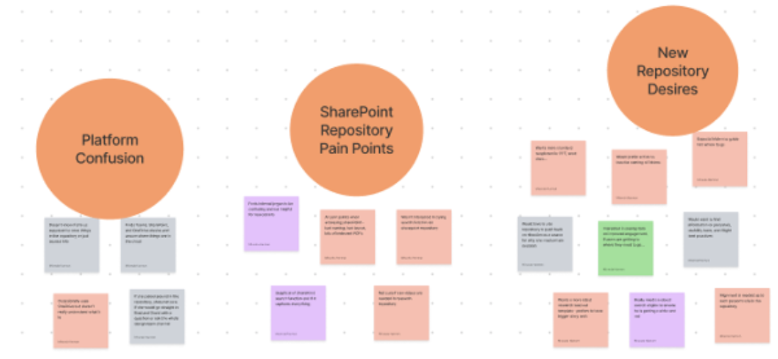
I interviewed four subject matter experts and eight primary stakeholders in order to understand the pain points and needs of these users. Affinity mapping helped me to organize notes for each set of interviews.
Some of the main themes I saw across both groups was a misunderstanding in the research repositories role, desire for self-service, and proving to clients what the user wants.


Affinity Mapping in Miro
Persona Development
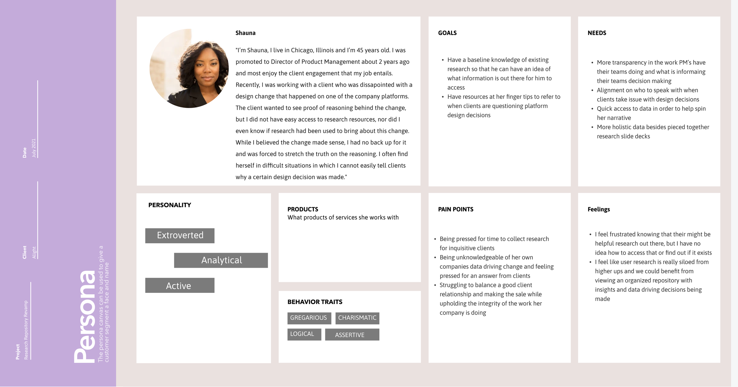
Using affinity mapping to synthesize my research allowed me to develop 3 personas following the primary stakeholders who will be regularly interacting with the repository.
My first and primary persona, Erica, has been working as a UX designer for about 2 years now and recently moved to a new company. Recently, she has been struggling with explaining to her product manager why she has made certain design decisions. She feels she is making the right decision based on what she has learned about these users, but she doesn't have tangible data at her fingertips to show to the product manager. With these issues bubbling up, Erica really needs and wishes for an easily accessible resource for finding previously conducted user research that will drive and validate her designs. She also is looking for clarification on the way her new company is aligning with research and design to create a collaborative experience.
My other two developed persona’s, seen below, exemplify the characteristics and desires of a UX researcher and executive employees. These two groups played a large role in my insight development and subsequent repository design.

User Journey & Pain Points

In thinking about Erica and her struggles, I looked at what happens when she tries to use the current SharePoint repository. Through her journey, I was able to showcase the many pain points users like her face when working with the platform. The culmination of these struggles results in most users, like Erica, giving up and never revisiting the site.
Concept Development & Ideation
Thinking about Erica and other stakeholders here, my synthesis founded 3 main insights.
Inconsistency in information organization and taxonomy creates user skepticism in the validity and robustness of the current repository.
Many individuals desire more self-service opportunities surrounding research and data collection in order to feel less reliant and more connected to the findings.
While each user has different needs and expectations of the repository, there is a pattern of desiring a standardization and transparency for general improvement.
With those insights in mind, I looked back on the possible solutions I had been considering. Conducting a survey after interview synthesis allowed me to further delineate specific user wants and needs to determine which platform will prove best as the Alight UX Research Repository. Platforms in consideration were SharePoint, Confluence, DoveTail, Airtable, and EnjoyHQ – each chosen for the variety of features and capabilities they provided.
The table below highlights several of the features that were assessed during competitive product analysis during initial stages of the project. My interviews determined that live document editing, tagging functionality, robust search, and internal document housing were of the most interest to users. The subsequent survey uncovered that repository users most desired a platform that internally housed documents, has a robust search engine, and tagging, whereas live document editing was deemed as unnecessary.

Prototyping & Final Solution
Therefore, with EnjoyHQ, DoveTail, and Airtable not filling the appropriate need, and SharePoint lacking functionalities desired by users and having gained a user-bias due to negative previous experiences, Confluence was determined to be the best choice for the new Alight UX research repository. Confluence will provide Alight users with a new repository experience while offering stronger functionality in terms of search capability, tagging, and a more customizable user experience.


Due to restraints with not having access to the full Confluence site at this time, I decided to work on my Figma skills and develop a wireframe to test with the the design team to determine how they would prefer to interact with the site. I conducted a usability test with my Figma prototype and 12 participants. I gained valuable feedback on set up of the overview page and the organization of research within pages.
Results of the usability study allowed me to develop a final document which will guide the person who sets up the Confluence site once they get a license.
Update: As of Fall 2021, the Confluence site was set up using these blueprints and now functions as a complete repository for design and product team members to access.
Impact & Deliverables
So what is Erica able to achieve with the new UX research repository platform. First, she is able to quickly browse the overview page for information on what the repository is, when, why and how to use it, and what pages have recently been updated. Also, Erica can complete an advanced search to reliably find out if something exists in this repository.


Next, she can use the page tree on the side to start her search. The main parent level of pages she will see is broken down by platforms. User testing found that most users resonated with searching by platform, product, subcategory, and then project name. Additionally, Erica will also see links to child pages of information on the screen so that she doesn’t have to look at the tree the entire time.
Finally, when Erica is having a hard time finding some content she was interested in, her coworkers can help her out by using the tag functionality to tell her where she might find the research she is looking for. Confluence even lets users use images and emoji's to make it more fun and engaging. And these are just a few of the great features that Confluence has to offer.
My interviews, synthesis, and insight development led me to conclude this solution and information organization will create a more successful environment for Alight users, developing a greater connection between researchers, designers, and executives.
*Click to open report deliverables


